
 ChatGPT
 Perplexity
 Grok
Grok
 Google AI
Your website is more than a place to share information. It is part of your brand experience. Every element, from your logo and colours to your buttons and contact forms, contributes to how visitors perceive your business. Yet forms often keep default styles that look disconnected from the rest of the website.
WordPress form styling helps you create forms that feel like a natural part of your website, not an added component. With the right colours, fonts, spacing, layouts, and buttons, you can create a consistent experience while making your forms easier to use. The good news is that you do not always need advanced coding skills to do it.
Why WordPress Form Styling Matters for Your Brand
A form may seem like a small part of your website, but it can have a direct impact on the user experience. When a contact, signup, or lead form matches your website’s visual identity, visitors are more likely to see it as trustworthy and professional. Consistent design also makes the entire website feel more polished.
On the other hand, a form with unrelated colours, fonts, or layouts can look out of place. This inconsistency can distract users and make the form feel less credible. Well-designed branded contact forms create a smoother transition between your website content and the point where visitors are asked to take action.
What Elements Can You Customize in a WordPress Form?
Modern WordPress forms can be customised in many ways. You can adjust visual elements to reflect your brand while keeping the form simple enough for visitors to complete. The most important areas usually include colours, typography, spacing, borders, buttons, and field layouts.
Colours and Backgrounds
Colours are one of the easiest ways to connect a form with your brand. Use your existing brand colours for elements such as headings, field borders, buttons, and links. Your background should provide enough contrast so fields and text remain easy to read. Avoid using too many colours, as this can make the form look busy and distract visitors from completing it.
Fonts and Typography
Typography should match the rest of your website. If your website uses a particular font family and heading style, carry the same approach into your forms. Keep field labels, instructions, and error messages readable and easy to distinguish. Consistent typography makes custom form design feel intentional and helps users understand what information they need to provide.
Borders, Spacing, and Layout
Small details such as padding, field height, border thickness, and spacing can significantly affect a form’s appearance. Give each field enough breathing room so users can scan the form easily. Keep related fields together and avoid squeezing too many inputs into a small space. A clean layout can make even a simple form feel more professional.
For broader guidance on creating effective form layouts, see 15 Form Design Best Practices That Increase Conversions.
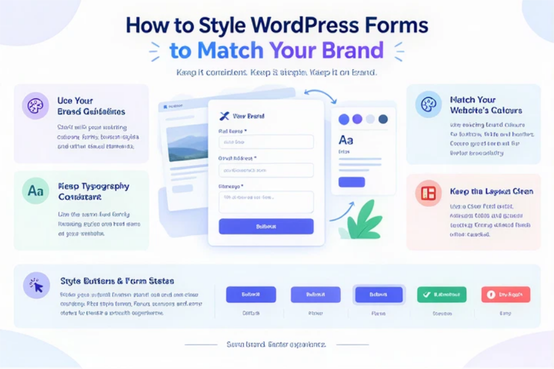
How to Style WordPress Forms to Match Your Brand
Creating a branded form does not mean adding every possible design feature. The goal is to make the form visually consistent with your website while keeping the user experience straightforward. Start with your existing brand identity and apply it carefully to the form.
Start With Your Brand Guidelines
Before changing your form, look at your existing brand guidelines. Identify the colours, fonts, button styles, border treatments, and other visual elements already used across your website. These guidelines give you a clear starting point for form customization and help prevent your form from developing a completely different visual identity.
Match Your Website’s Colours
Choose colours that already appear throughout your website rather than introducing a new palette. Your primary brand colour can work well for buttons and important actions, while neutral shades can be used for field backgrounds and borders. Always check the contrast between text and backgrounds so the form remains accessible and easy to read.
Use Consistent Typography
Your form should look as though it belongs to the same website as the rest of your content. Use the same or a closely related font family, heading hierarchy, and text sizing. Field labels should be easy to identify, while supporting instructions can be slightly smaller. Consistent typography creates a more unified experience without requiring complicated design changes.
Keep the Form Layout Clean
A visually attractive form can still perform poorly if it is difficult to complete. Use a logical field order and keep the number of fields relevant to the purpose of the form. Align fields consistently and provide enough spacing between sections. If a form requires several pieces of information, consider grouping related fields to make the process easier to follow.
If you are also adding a form to a WordPress site, How to Add an Online Form to Your WordPress Website covers the basic process of getting an online form onto your site.
Style Buttons and Form States
The submit button is one of the most important elements of your form because it tells users what to do next. Give it enough visual contrast and use wording that clearly communicates the action. You should also consider hover, focus, success, and error states. These details make the interaction feel more responsive and help users understand what is happening after they submit information.
Best Practices for Custom WordPress Forms
Good custom WordPress forms balance branding with usability. Don’t design a form just to make it look impressive. Every design decision should support the user’s ability to understand and complete the form. Use sufficient contrast, readable text, clear labels, and consistent spacing throughout the layout.
Also test the form on different screen sizes. A design that looks excellent on a desktop may feel cramped on a mobile device. Check the field widths, button size, spacing, and text alignment on smaller screens. Keep accessibility in mind, especially colour contrast, keyboard navigation, labels, and error messages.
How a WordPress Form Builder Makes Form Customization Easier
A WordPress form builder can simplify creating and styling forms. Instead of manually building every field and modifying code, you can often configure the form through visual controls. Depending on the builder, you may be able to adjust layouts, colours, typography, buttons, field styles, and other elements from the form interface.
This approach is particularly useful for businesses that need to create multiple forms with a consistent appearance. Once you establish a design that matches your brand, you can apply similar styling across contact forms, lead capture forms, signup forms, and other website forms. A no-code form builder can make this process even more accessible for users who do not work with CSS or WordPress code.
If you are comparing different approaches to building forms, Best WordPress Form Builder for Lead Generation in 2026 provides further context on choosing a suitable WordPress form builder.
Common Mistakes to Avoid When Styling WordPress Forms
- Using too many colours: Adding several unrelated colours can make your form look cluttered. Stick to your established brand palette and use accent colours sparingly.
- Ignoring mobile responsiveness: A form that looks good on desktop may be difficult to use on smaller screens. Check field widths, button sizes, spacing, and text alignment across different devices.
- Prioritising appearance over usability: Avoid excessive animations, decorative elements, or unusual layouts that make the form harder to understand or complete.
- Using poor colour contrast: Light text on a light background or subtle field borders can make important information difficult to read. Maintain sufficient contrast for accessibility.
- Adding unnecessary fields: Asking for information you do not actually need can make the form longer and discourage visitors from completing it. Only include fields that serve a clear purpose.
- Using inconsistent typography: Using fonts or text styles that differ from the rest of your website can make the form feel disconnected from your brand.
- Forgetting form states: Do not overlook hover, focus, error, and success states. These visual cues help users understand how the form is responding to their actions.
Create Branded Forms Without Complex Code
You do not need to be a developer to create a form that fits your website. The right combination of your brand colours, typography, spacing, field layouts, and button styles can transform a basic form into a polished part of your website.
A visual no-code form builder can make this process even easier by giving you controls to create and customise forms without editing CSS or HTML. This allows marketers, business owners, and website managers to make design changes while maintaining a consistent brand experience.
For businesses looking to create and customise forms without unnecessary complexity, LeadX Forms provides a drag-and-drop solution for building online forms.
Conclusion
Your forms should feel like part of your website, not an afterthought. Effective WordPress form styling combines your brand identity with a simple, accessible, and user-friendly design. By matching your colours and typography, improving spacing, simplifying layouts, and styling key elements like buttons, you can create forms that look professional and feel familiar to visitors.
The best form design isn’t necessarily the most elaborate. It communicates clearly, supports your brand, and makes it easy for visitors to take action.
Frequently Asked Questions
You can style a WordPress form by customising its colours, fonts, field layouts, borders, spacing, buttons, and other visual elements. Many WordPress form builders provide visual styling options, while more advanced customisation can be done with CSS.
Yes. Many modern form builders offer no-code or low-code styling options. These allow you to change colours, typography, layouts, buttons, and field appearance through visual settings rather than manually editing code.
A professional form uses consistent branding, readable typography, clear labels, balanced spacing, strong colour contrast, and a logical layout. It should also work well across desktop and mobile devices.
Start by identifying the fonts, colours, button styles, and spacing patterns used on your website. Then apply those same design elements to your form while maintaining enough contrast and spacing for usability.
Yes. A WordPress form builder can make it easier to create forms that follow your brand guidelines. Depending on the tool, you can customise colours, typography, layouts, buttons, and other design elements without building the form entirely from scratch.