 ChatGPT
 Perplexity
 Grok
Grok
 Google AI
Every form has one purpose. It should turn visitors into leads. Yet many online forms fail to do that. They ask for too much information. They confuse users. They take too long to complete. As a result, visitors leave without submitting them. Businesses lose valuable leads every day.
That is why best practices in form design are so important. A well-designed form removes friction. It feels simple and easy to complete. It guides users from the first field to the final click. Even small design improvements can create a better experience. They can also improve form conversion optimisation and help increase form conversions.
This guide covers 15 proven techniques that make forms more effective. You will learn how to create clearer layouts, write better labels, and improve mobile usability. You will also discover practical ways to reduce abandonment and design forms that encourage more people to convert.
Why Form Design Matters
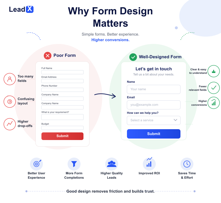
Your form is often the final step before a conversion. A visitor may explore your website first. They may be ready to take action. However, a poor form can stop them. Long forms and confusing layouts create frustration. Many users leave before they click submit.
Good forms make the process simple. Every field should have a purpose. Every label should be easy to understand. These web form design best practices remove friction. They also create a smoother experience from start to finish.
User experience has a direct impact on results. Easy forms keep visitors engaged. They reduce drop-offs and improve form completion rates. This leads to better form conversion optimisation and helps businesses generate more qualified leads.
15 Form Design Best Practices That Increase Conversions
Good form design is not about adding more features. It is about making every step easier for the user. Small improvements can remove friction and encourage more people to complete your forms. These proven practices will help you create a better experience and increase conversions.
1. Keep Forms Short
Only ask for information you truly need. Every extra field adds more effort. Long forms often reduce completion rates. Short forms feel faster and encourage more people to submit them. Focus on quality over quantity.
2. Use Clear Form Labels
Users should know exactly what each field requires. Avoid vague wording or technical terms. Clear form labels reduce confusion. They help users complete forms with confidence. Simple wording improves accuracy.
3. Include Every Form Field
Review every field carefully. Remove anything that does not add value. Good form field optimisation keeps forms simple. It also improves the overall user experience. Every field should serve a purpose.
4. Use the Right Input Types
Choose input types that match the information you need. Use dropdowns, checkboxes, radio buttons, and date pickers where appropriate. This makes online form design faster and easier to use. It also reduces user errors.
5. Add Inline Validation
Show errors as users complete each field. Do not wait until they submit the form. Inline validation helps users fix mistakes immediately. It reduces frustration and saves time. This creates a smoother experience.
6. Design Mobile-Friendly Forms
Many users complete forms on their phones. Your forms should fit every screen size. Keep buttons easy to tap and fields easy to complete. Mobile-friendly forms improve usability and increase completion rates. Test forms on different devices.
7. Break Long Forms into Multiple Steps
Some forms need more information. Split them into smaller sections rather than using a single long page. Multi-step forms feel less overwhelming. They also encourage users to finish the process. Each step should feel simple.
8. Write Better Call-to-Action Buttons
Your button text should encourage action. Avoid generic words like “Submit”. Use clear and specific call-to-action buttons such as “Get My Quote” or “Start Free Trial”. Strong CTAs guide users to the next step. Action words increase clicks.
9. Build Trust with Helpful Microcopy
Small pieces of supporting text answer common questions. Explain why you need certain details. Reassure users that their information is secure. Trust encourages more people to complete your forms. Honest messaging builds confidence.
10. Reduce Form Abandonment
Many users leave because forms feel difficult or time-consuming. Remove unnecessary questions. Make instructions clear. Simplify every step to reduce form abandonment and improve completion rates. A smoother journey keeps users engaged.
11. Prioritise Accessible Form Design
Everyone should be able to use your forms. Choose readable fonts and strong colour contrast. Support keyboard navigation and screen readers. Accessible form design creates a better experience for every visitor. Accessibility also expands your audience.
12. Use Smart Defaults Where Appropriate
Pre-fill information when it makes sense. Select common options automatically where appropriate. Smart defaults save time. They also reduce user effort without limiting flexibility. Always allow users to edit them.
13. Show Progress Indicators
Users like knowing how much is left. Progress bars work well for longer forms. They set clear expectations. They also encourage users to complete every step. Visible progress reduces uncertainty.
14. Test and Optimise Regularly
Even great forms can improve over time. Test different layouts, field orders, and button text. Measure the results carefully. Continuous testing is one of the most valuable form UX best practices. Small updates can deliver better results.
15. Personalise the User Experience
Not every user needs the same questions. Display fields based on previous answers. This keeps forms relevant and easier to complete. Personalisation supports high-converting form design, strengthens lead-generation form design, and increases form conversions. Relevant forms create better engagement.
Common Form Design Mistakes to Avoid
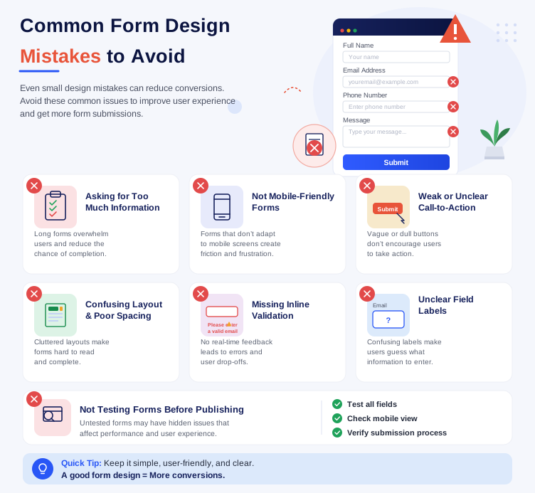
Even small design mistakes can reduce conversions. They create friction and make forms harder to complete. Avoiding these common issues can improve the user experience and encourage more submissions.
Common mistakes include:
- Asking for too much information.
- Creating forms that are not mobile-friendly.
- Using weak or unclear call-to-action buttons.
- Designing confusing layouts with poor spacing.
- Missing inline validation and error messages.
- Using unclear field labels.
- Not testing forms before publishing.
These issues can frustrate users and increase form abandonment. Fixing them can improve completion rates and create a smoother experience.
How LeadX Makes High-Converting Forms Easy
Creating high-converting forms should be simple. LeadX Forms helps businesses build professional forms without coding. Every feature is designed to improve the user experience and increase conversions.
The drag-and-drop builder makes form creation fast. Conditional logic shows only relevant questions. This keeps forms shorter and easier to complete.
LeadX also supports multi-step forms for longer submissions. Every form is fully mobile-friendly. Users enjoy a smooth experience on every device.
Built-in analytics track form performance. Integrations connect with your favourite tools. Together, these features help you build smarter forms that deliver better results.
Conclusion
Good form design creates better user experiences. It also helps increase conversion rates. Small changes can make a big difference. Clear labels, shorter forms, and strong CTAs encourage more users to complete the process.
Keep reviewing your forms as user behaviour changes. Test different layouts and improve weak areas. Regular optimisation helps you capture more leads and deliver better results over time.
Ready to build forms that convert? Create a free LeadX account or explore LeadX Forms. Start designing smarter forms that are simple, effective, and built for growth.
Frequently Asked Questions
Keep forms short and simple. Use clear labels for every field. Add inline validation to prevent errors. Design forms for mobile devices. Write strong CTA buttons that encourage action. These practices improve the user experience and increase conversion rates.
Remove unnecessary fields from your forms. Keep the layout clean and easy to follow. Use clear instructions and helpful error messages. Test different designs and CTA buttons regularly. Small improvements can lead to more completed submissions.
Inline validation checks user input as each field is completed. It highlights errors immediately. Users can correct mistakes without restarting the form. This reduces frustration and improves completion rates.
Ask only for the information you need. Short forms usually perform better. Longer forms should be split into multiple steps. This makes them easier to complete and reduces form abandonment.
Many users submit forms from their phones or tablets. Mobile-friendly forms load faster and fit smaller screens. They are easier to complete with touch controls. A better mobile experience can improve user satisfaction and increase conversions.