
 ChatGPT
 Perplexity
 Grok
Grok
 Google AI
More people now complete forms using mobile devices. Poor mobile experiences can quickly drive visitors away. Tiny fields cause frustration when typing and selecting. Slow, cluttered forms can also reduce the number of completed submissions. Mobile form design addresses these problems through thoughtful layouts. It makes forms easier to use anywhere.
Why Mobile Form Design Matters
Mobile visitors expect websites to work smoothly everywhere. Desktop layouts often fail on smaller screens. Users may struggle with cramped controls and awkward scrolling. These problems can directly affect form completion rates.
Mobile-friendly forms create better experiences for visitors. People can submit enquiries while travelling or working. They can register, book, enquire, or purchase quickly. Businesses therefore need forms designed around mobile behaviour.
What Makes a Form Mobile-Friendly?
A mobile-friendly form adapts naturally to different screen sizes. It should remain readable without excessive zooming or scrolling. Controls should also respond comfortably to touch interactions. Clear spacing helps users avoid accidental selections.
Responsive forms adjust layouts across phones and tablets. They maintain usable proportions across different screen sizes. Text should remain readable throughout the experience. Supporting elements should never obstruct important form controls.
Good mobile form UX also considers user attention. Mobile visitors may complete forms in distracting environments. They may also face interruptions or limited connectivity. Simple interfaces help users complete tasks more efficiently.
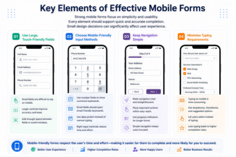
Key Elements of Effective Mobile Forms
Strong mobile forms focus on simplicity and usability. Every element should support quick and accurate completion. Small design decisions can significantly affect user experience.
Use Large, Touch-Friendly Fields
Small fields create problems for mobile users. Finger taps require more space than mouse clicks. Larger controls make selection easier and more accurate. Leave enough space between neighbouring fields. This reduces accidental taps during form completion.
Choose Mobile-Friendly Input Methods
Different questions need different mobile input methods. Number fields should trigger suitable numerical keyboards. Email fields should support convenient email keyboard layouts. Date selectors should avoid difficult manual typing. These choices reduce effort when completing mobile forms.
Keep Navigation Simple
Mobile users should move through forms effortlessly. Avoid unnecessary buttons and complicated navigation systems. Place important actions where users can find them easily. Progress indicators can help with longer forms. Clear navigation keeps users focused on completion.
Minimise Typing Requirements
Typing on smartphones requires more effort than on desktops. Reduce unnecessary text entry whenever possible. Use dropdowns, checkboxes, and suggested options appropriately. Let users select answers whenever possible. Shorter interactions support better mobile form optimisation.
Designing Better Mobile Form Layouts
Layout strongly influences how users experience forms. A cluttered screen can make simple tasks difficult. A clean structure helps users understand each step quickly.
Use a Single-Column Layout
Single-column layouts suit narrow mobile screens naturally. Users can move through fields from top to bottom. This creates a predictable completion path. Avoid placing unrelated fields side by side. Simple alignment also improves visual clarity.
Keep Important Content Visible
Users should understand the form’s purpose immediately. Show essential instructions before unnecessary supporting information. Place important actions where users can access them easily. Avoid forcing users through excessive introductory content. Each screen should provide clear next steps.
Make Buttons Easy to Find
Buttons should stand apart from surrounding form elements. Their labels should clearly describe the next action. Use enough spacing around important buttons. Avoid placing multiple competing actions together. Clear calls to action improve confidence in completion.
Mobile Form Optimisation for Better Conversions
Conversion-focused forms remove unnecessary barriers for users. Mobile visitors should reach submission with minimal effort. Review every stage of your form experience carefully. Small improvements can make completion noticeably easier.
Reduce Unnecessary Fields
Every additional field increases completion effort. Ask only for information your business genuinely needs. Remove questions that do not support follow-up actions. Consider collecting extra information later instead. For more guidance, read How Many Fields Should Your Lead Form Have?
Use Smart Defaults
Smart defaults can reduce repetitive user actions. Preselect common choices where appropriate and useful. Avoid assumptions that could create incorrect submissions. Location and language preferences can support helpful defaults. Always let users change selected options.
Use Clear Error Messages
Mobile users need quick guidance when errors occur. Show errors close to the relevant field. Explain exactly what information needs correction. Avoid generic messages such as “Invalid input”. Clear guidance helps users continue without frustration.
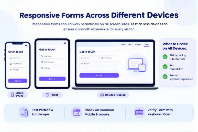
Responsive Forms Across Different Devices
Responsive forms should work across various screen sizes. Phones differ considerably in width, height, and resolution. Tablets also create different layout requirements. Testing helps identify problems before visitors encounter them.
Check your forms across common mobile browsers. Test portrait and landscape orientations when necessary. Review field spacing, button sizes, and text readability. Also check how forms behave when the keyboard is displayed.
Mobile Lead Forms and Customer Journeys
Mobile lead forms need especially careful design. Prospects may discover businesses through mobile searches. They may complete forms immediately after finding information. Delays or complicated fields can interrupt that journey.
Match form length with the user’s intent. High-intent visitors may be more willing to answer more detailed questions. First-time visitors may prefer shorter enquiry forms. Progressive information gathering can help when details matter.
Focus on High-Value Information
Collect information that helps qualify genuine prospects. Avoid questions that provide little sales value. Prioritise details supporting useful follow-up conversations. This keeps mobile lead forms focused and efficient.
Build Trust During Completion
Visitors need confidence before sharing personal information. Explain why you request important details. Keep privacy information easy to access. Use familiar wording throughout the form. Trust can influence whether visitors complete submissions.
Common Mobile Form Design Mistakes
Some problems repeatedly affect mobile form experiences. Identifying these issues helps prevent unnecessary abandonment. Review your current forms for common weaknesses.
- Using fields that require excessive manual typing
- Placing controls too close together
- Hiding important instructions below unnecessary content
- Using buttons that remain difficult to tap
- Showing unclear validation messages
- Creating long forms without useful progress indicators
- Ignoring keyboard behaviour during mobile completion
Avoiding these mistakes creates more usable forms. It also supports smoother customer journeys across devices.
How Mobile-First Design Supports Better Forms
Mobile-first design starts with smaller screens first. Designers then expand layouts for larger devices. This approach prioritises essential content and interactions. It also encourages simpler and more focused interfaces.
A mobile-first approach can significantly improve responsive forms. Developers consider touch controls from the beginning. Content receives clearer hierarchy and spacing. Unnecessary desktop elements become easier to identify. The result supports more consistent experiences across devices.
For broader conversion guidance, read The psychology behind high-converting forms. Understanding user behaviour can support stronger mobile form decisions.
Choosing the Right Form Builder
The right form builder can simplify mobile optimisation. LeadX Forms provides tools for creating WordPress forms. A suitable platform can make responsive design easier. It can also simplify field management and form updates.
Businesses can create forms around different mobile requirements. They can select suitable fields for each user journey. Conditional logic can also reduce unnecessary questions. These features help create cleaner mobile experiences.
WordPress users can also explore Best Contact Form Plugin Alternatives for WordPress when comparing form solutions. Consider mobile usability alongside features and flexibility.
Mobile Forms: Single-Step or Multi-Step?
Form structure can affect mobile completion experiences. Short forms often work well as single-step layouts. Longer forms may benefit from divided sections. The right choice depends on form length and purpose.
For longer mobile forms, compare Multi-step forms vs single-step forms. Breaking complex forms into smaller stages can reduce perceived effort. However, unnecessary steps can create additional friction.
How to Test Mobile Form UX
Testing reveals problems that desktop reviews often miss. Complete forms using different phones and browsers. Check every field from the user’s perspective. Notice where typing or navigation becomes difficult.
Test common scenarios involving errors and corrections. Submit forms using slower network conditions where possible. Check whether confirmation messages appear correctly. Review analytics for unusual mobile abandonment patterns.
Testing should continue after major form changes. New fields can introduce unexpected mobile usability problems. Regular reviews help maintain a reliable experience.
Conclusion
Mobile users expect simple and responsive form experiences. Mobile form design should eliminate unnecessary barriers to completion. Clear fields, simple layouts, and useful validation matter. Mobile-first thinking also supports stronger overall usability. Review forms regularly across different mobile devices. Better experiences can help turn visitors into leads.
Frequently Asked Questions
Mobile form design focuses on smartphone-friendly form experiences. It prioritises touch controls, readable layouts, and simple interactions. Good designs also reduce unnecessary typing and scrolling.
Responsive forms adapt their layouts to different screens. Fields, buttons, spacing, and text adjust accordingly. Users should avoid excessive zooming or horizontal scrolling.
Simpler forms reduce effort during completion. Clear fields also help users avoid unnecessary mistakes. Faster interactions can encourage more visitors to submit.
They often benefit from fewer unnecessary questions. Mobile typing requires more effort than desktop typing. Focus on information needed for immediate lead qualification.
Test forms across different devices and browsers. Check field sizes, keyboard behaviour, navigation, and validation. Complete forms using realistic user scenarios.